BESPOKED 2024 | Best Finish Award
Some musings about this year’s winners and what drew me to them…
For those of you coming here unfamiliar with me, and why I've been given the responsibility of scrutinising for BEST FINISH again this year, hello. My name is Ian Greyharbour. I've been a designer/maker for the better part of two decades. I've been lucky enough to have been able to work in refinishing alongside the insightful, skilled, and ever-reclusive Dan Cole of Cole Coatings Workshop for a number of years and then another spell with Quinntessential Customs helping Paul grow his fledgling finishing workshop. My finishing work can be found in shops, homes, and galleries around the world but more importantly, on thousands of bikes, some of which have won an assortment of prizes at Bespoked shows throughout the years, including Best Finish.
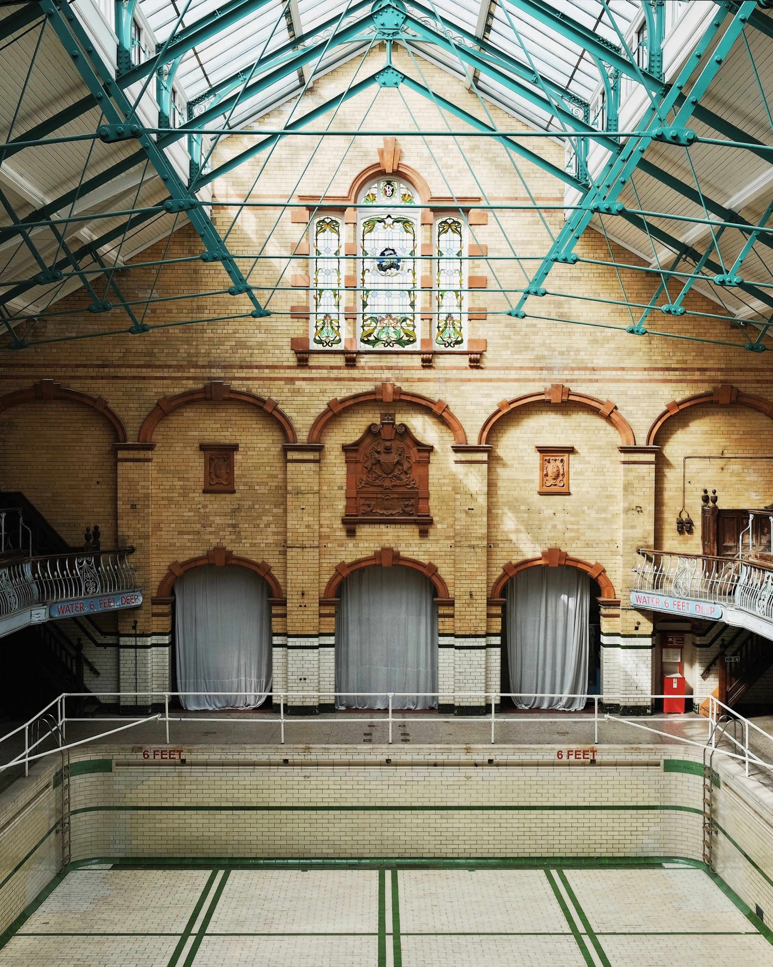
This year's show at Manchester's resplendent Victoria Baths was a little smaller than previous years, with fewer exhibitors, but no shortage of excellent work throughout.
Far more talented professionals have written much more interesting things than I could say about this year's show so I'll get straight to the finalists for Best Finish and how I chose them.
(I’ve borrowed images from a few places for the sake of showing context. I’ve credited and linked to the appropriate sources. This site isn’t in any way monetised but, if I’ve used your pictures here and you want me to take them down, just let me know and I’ll do it promptly.)
1st Runner Up
CURVE CYCLING | Titanosaur
The Titanosaur is hard to miss.
It quite appropriately pays respect to the frameset material by leaving some parts exposed.
Why build from wood with a nice grain if you don't show it to people?
This practice translates well for titanium and stainless bikes and has been utilised well here in that half-painted/half-exposed approach has the added bonus of making the bike somehow appear smaller; if it was all one colour, it would look massive!
The colour choices are selected in order to represent the reptilian flesh of a Titanosaur dinosaur which is the type of playfulness that all the best bikes should have.
The common standard of a front-to-back fade makes what could seem like a “novel” bike appear somewhat normal in appearance when compared to other contemporary bikes. The front starts in a rich moss green, transitions somewhat abruptly into an olive, then another feathered-edge transitions into an off-white, much like we might see if we followed the leathery tail of Godzilla across it's torso and towards it's soft belly. Top stuff.
There was no doubt that this bike was going to get a lot of attention at the show and beyond, so the logos and graphics have been popped in place in a vibrant but none-too-overpowering orange, just to ensure that a photo of this bike won't be taken with the name of it's skilled makers being overlooked.
The tiny dinosaur silhouette on the rims is an excellent detail flourish that should curl the sides of your mouth upwards as soon as you see it.
This finish reminds us all that whilst we might get bigger, we never have to grow up.
Images borrowed from: https://bikepacking.com/plog/2024-bespoked-uk-part-3/
2nd Runner Up
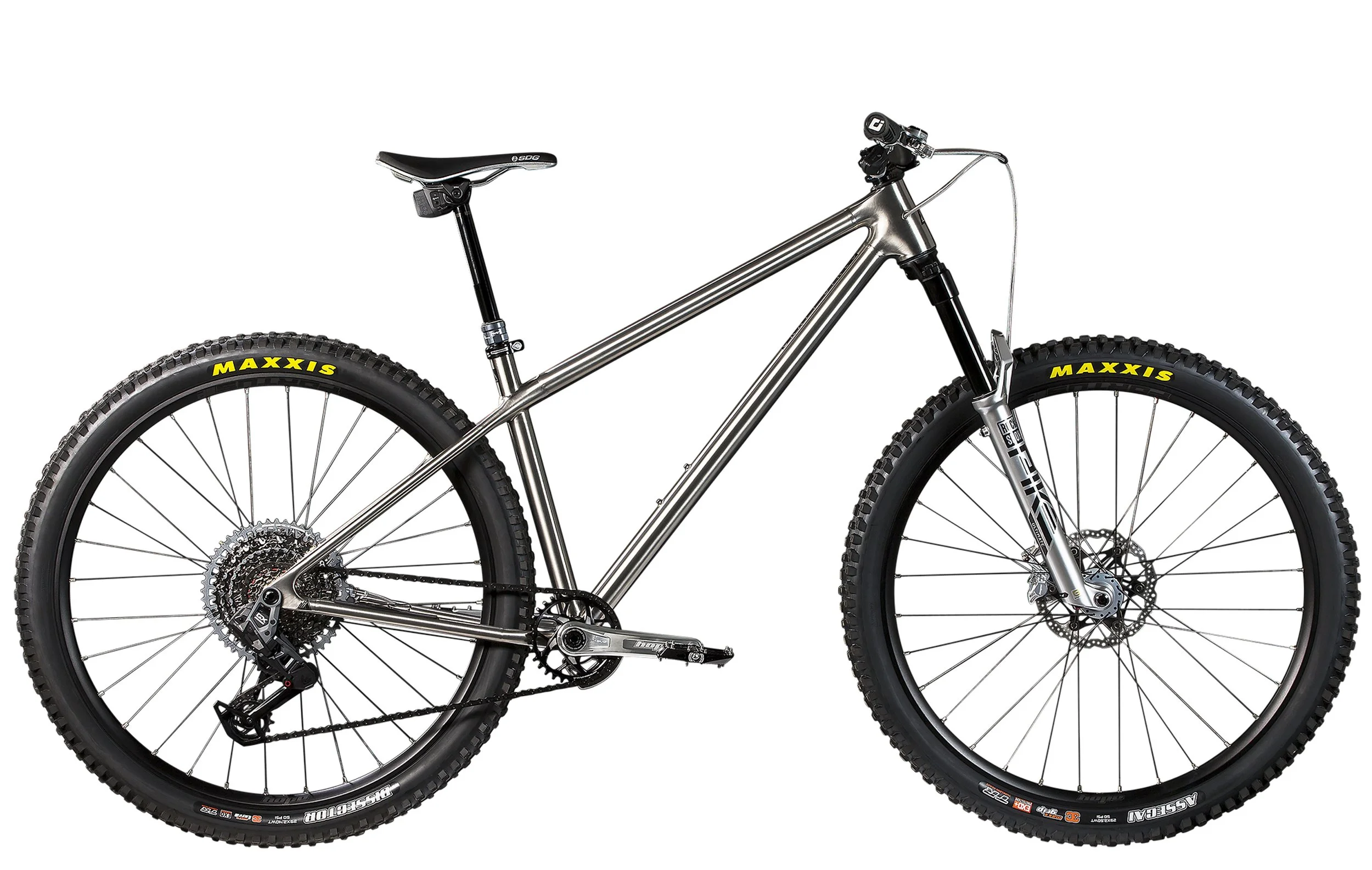
CRAFT BIKES | Hard Tail
Finish isn't just paint right?
Mirror polished jewellery is finished. Oiled and waxed furniture is finished.
Finishing is the culmination of every aesthetic decision and the efforts involved in achieving the final appearance of a given substrate.
Craft Bikes knows this.
Their hardtail offers “raw” for the deliberate appearance of raw. It's not unpainted because they forgot. It's not unpainted because they ran out of time. It's not unpainted because they couldn't be bothered. Don't consider this an afterthought. It's deliberate and it's diligent.
This frame gives the workmanship of the frame assembly the centre stage and allows the owner the freedom to add their personality in the build.
Look to this bike for a meticulously hand-brushed surface with parallel scratches on every tube. A similar clean effect could have been achieved quickly with shot peening, or media blasting but instead, the builders have opted to highlight – or perhaps lowlight, given the subtlety of the effect - that the frame was built and finished by hand. They want you to see the material. They want you to see the joins of each tube, and display proudly the construction elements of the frame.
The nude effect is complimented by subtle Cerakote details in the branding, a super tough and hard-wearing finish often used in firearms.
This is raw done right and deserving of a place in this list.
3rd Runner Up
MEDUSA CYCLES | Deka
It's difficult not to love this bike.
At even a casual glance, it's very obviously a detail focussed labour-of-love from everyone involved.
Visually, this is a deceptively minimal front-to-back colour split that doesn't show off but rewards further investigation with embellishment and flourish.
The green and crème solid block colours put me in mind of Victorian era railway liveries, or even the architectural design of the same period... this year's venue of Victoria Baths is a perfect example of those hue pairings and acts as an almost made to measure backdrop for this bike.
The beautiful hand-painted bird of prey, and the coins on the seat stay eyes are filigree on a finish that serves the frame's shape well.
It has a romantic explorer feel about it that puts me in mind of perhaps a bike ridden by a lead character in Famous Five novel.
From the colour choices, to the typeface, everything about the design is well-balanced and skilfully executed, and just seems “correct” for the bike.
The finish on this bike says that wherever you ride it, you're going on an adventure.
Images borrowed from: https://www.instagram.com/medusa.cycles/
Winner
Untitled Custom Paints | Santa Cruz
https://www.instagram.com/untitled_custom_paint
This is a finisher's finish, steeped in technical skill. To anyone who has spent hours in front of a frame set, light-headed from the paint fumes, this one clearly represents hours and ours of work.
Well selected colours combine to give the feel of a soft, pastel Neapolitan ice-cream. The colours have been chosen with significant consideration for the anodised hardware on the bike, so nothing feels accidental.
There's a hugely adventurous amount of technical masking and stencilling on this bike which on it's own is a massive feat.
The scheme takes a commonly mined graphic style in cycling – topographical diagrams, and gives it a hand-illustrated appearance, without having been hand-illustrated. There are no visibly repeating elements in the design and this serves to reward your eyes with a different compositional appearance from every viewing angle. The graphics have no overlaps or repeats throughout; in spite of the somewhat random appearance of the line work, it has clearly had many hours of planning and prep before being executed – and I might even go so far as to surmise that this design scheme grew organically during the application of each new element. That is to say, there was clearly a plan BUT as each new feature came to occupy space, it impacted where the next painted element could comfortably sit whilst not being disruptive or contradictory to the final vision. This task of balancing the design gets more and more difficult as the finish develops.
Respectfully replaced factory branding gives the bike legitimacy in spite of the design being somewhat “out there” or “busy”.
There's clearly a lot of “big gun” skill, evident in the clean and even colour panels, and this I coupled with a lot of airbrush skill too in the form of solid colour coverage and crispy lines.
As if it weren't great already, there's the further introduction of foil leaf to add yet more tricky technical flourishes. At any one of the bikes many finishing stages, things can go horribly wrong; as more and more techniques, chemical conflicts and further graphics are stacked up, the cost of a mistake gets even more significant. There's no CTRL+Z function here. In that regard, it's quite a brave undertaking to stack and layer such a multitude of effects.
Look for the illustrative elements which match perfectly and line up as they transition from the frame to the fork. That's not accidental. You can't paint the fork whilst its in the frame, you must separate them, paint them as individual pieces, and you only find out if you got it just right, when you peel off the layers of ,asking tape and carefully de-burr all the paint edges.
The overall design is complex and busy but never fussy, again, only once you've painted the bike can you truly know if your idea worked!
The post-paint correction and detailing shows another significant time, skill and tooling investment that many finishers simply overlook. The clear coat is smooth and sharp with no discernible dry-spray or area of the surface overlooked by a polisher. Factory finishes on big brand bikes are rarely polished at all; this is something that sets wet-paint custom finishing apart. Having said that, even premium finishes like this often simply avoid polishing the inside of a fork blade or chain and seat stays; the efforts involved increase the cost beyond the point of good taste for most people, and on top of that, you'll probably never even see that bit! Even still, the efforts have been made and it's such a treat to see.
Overall, this finish certainly isn't perfect. There are a number of places where improvements can be made and these can only come with experience. To be honest, that's to be expected from something so wildly adventurous as this scheme.
The final result is excellent paint by a skilled painter who cares about doing the best finish they can in the vain hope that someone will notice. It was noticed.
As I type this, Untitled Custom Paint has less than 100 followers on Instagram. If you're a bike brand looking for good work, or a customer looking to refresh or revamp your bike, you’d do well to contact the them before their waiting list gets silly!
They care about the details.
A worthy winner of a rosette this year for sure.


